The Cost of the Financial Meltdown
December 4, 2009
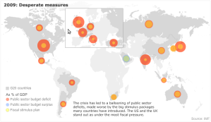
I was reading some news and came across this interesting interactive chart.
The cost of the financial meltdown: Deficits and spending
It lets you see budget surplus, deficit and stimulus plans for the countries around the world in a nice graphical format.
Be warned…
The large orange circles can get a bit scary…
for 2009 in the U.S. deficit = -13.5% (pretty large orange circle)
No comments yet
